

Global brands spent $277 billion on social ads in 2025, and the average dashboard still can't answer the one question a CFO actually cares about: what did we get back?
This guide is for B2B marketing teams, social managers, and demand gen leaders who want a dashboard that changes decisions, not a list of posting tips. We'll cover what to measure, how to build it, and how to tie every metric to a business outcome.
TL;DR
- A useful social media analytics dashboard maps every metric to a funnel stage and a business outcome, not just a reporting slide.
- The five metrics that matter for B2B: reach efficiency, engagement rate by ICP, click-through to owned properties, pipeline-attributed mentions, and earned media value.
- Average engagement rates sit at 1.4-2.8% across platforms. Most dashboards don't show this baseline, so teams have no idea if they're above or below it.
- CPMs are up 18% year over year, which means dashboards must report efficiency metrics, not just raw reach.
- Ordinal centralizes drafting, scheduling, and analytics so teams can stop stitching Buffer, Sheets, and Zapier together every week.
What a Social Media Analytics Dashboard Is
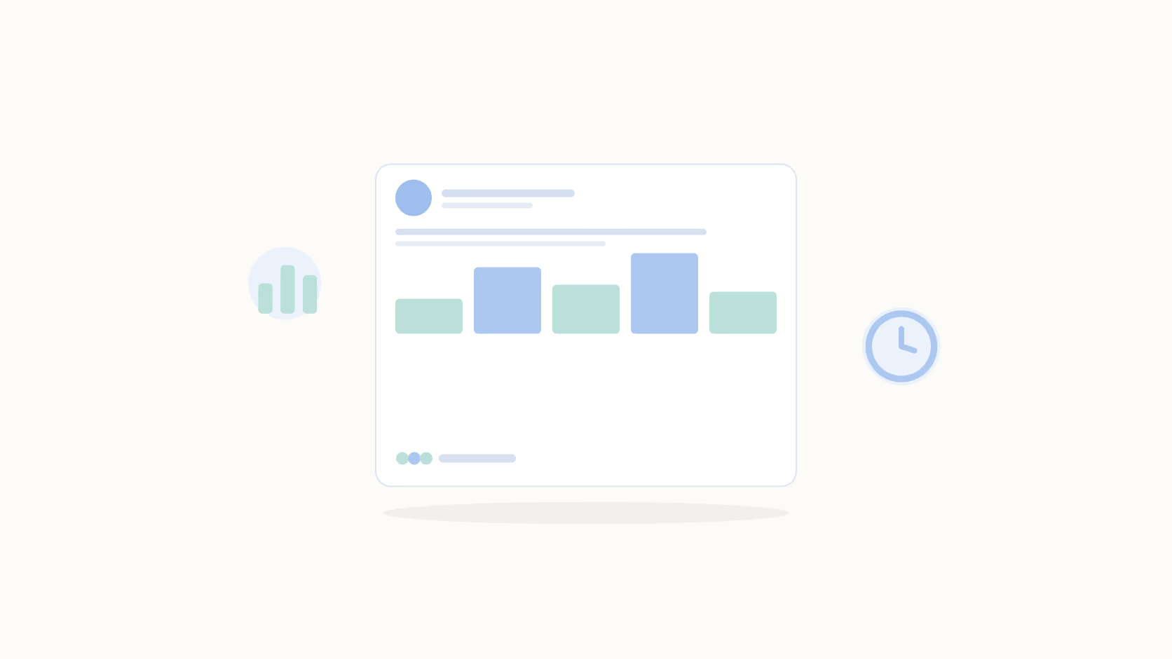
A social media analytics dashboard is a centralized view of performance metrics across your social channels, pulling data from platforms like LinkedIn, Twitter/X, and Instagram into one place so you can track reach, engagement, and conversions without logging into each platform separately. That's the reporting version.
The operational version goes further: it tells you what to do next.
Most off-the-shelf dashboards from Buffer and Hootsuite are firmly in the first camp. They show what happened. They don't surface why, or what content mix to change, or which posts drove actual pipeline activity. For a B2B team running a B2B social strategy tied to revenue goals, that's a meaningful gap.
A dashboard built around impressions and follower counts will tell you a lot about impressions and follower counts, and not much else.
Why B2B Teams Need a Different Kind of Dashboard
Most social analytics tools were built for consumer brands posting on Instagram in 2016. The metrics they surface (likes, shares, follower growth) made sense when the goal was brand awareness at scale. B2B looks nothing like that.
Your ICP is a few hundred companies, not a few million consumers. Sales cycles run months, not minutes. LinkedIn drives most of the meaningful engagement, and the content that converts a VP of Engineering looks nothing like a viral carousel.
With CPMs rising 18% year over year in 2026 (Digital Applied, 2026), efficiency tracking isn't optional anymore. A dashboard that only shows reach doesn't tell you whether that reach cost twice as much as last quarter.
The cost of getting this wrong is budget misallocation, an inability to justify social spend at renewal time, and a CFO who keeps asking why the team needs four social tools when nobody can produce a ROI number.
The 7 Metrics That Belong on a B2B Social Analytics Dashboard
1. Reach and Impressions
LinkedIn impressions explained: an impression is counted each time your content appears in a feed, whether or not it was clicked or read. Reach measures unique accounts exposed.
These are the floor, not the ceiling. Necessary context for everything else, but meaningless alone. On their own they mean nothing. Pair them with the metrics below or leave them out of the executive view.
2. Engagement Rate
Engagement rate = (likes + comments + shares) / impressions. Average rates ranged from 1.4% to 2.8% across major platforms in 2025 (engagement benchmarks, Keekee360, 2025). That's your baseline.
If you're hitting 5%+ on LinkedIn personal profiles, you're in strong territory. Below 1% means the content isn't resonating, the audience isn't right, or both. See the full breakdown of LinkedIn metrics to track for platform-specific context.
3. Click-Through Rate to Owned Properties
CTR measures how often someone goes from your social post to your website, landing page, or gated asset. For B2B, a CTR of 0.5-2% on organic posts is a reasonable range. Below that, either the offer isn't compelling or the audience doesn't trust the content enough to click.
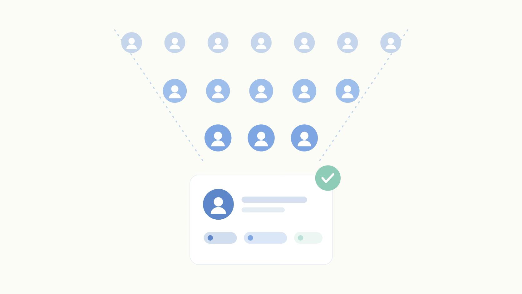
4. ICP Engagement
This is the metric most dashboards skip entirely, and it's arguably the most important one. Who is engaging, not how many. Comments per post increased 107% on X and 37% on LinkedIn year over year in 2025 (Keekee360, 2025), which means platforms are getting noisier, not quieter. The signal is whether the right accounts and titles are in your comments and likes.
Fifty engagements from decision-makers at target accounts is worth more than 500 from people outside your ICP.
5. Earned Media Value
Earned media value (EMV) estimates what your organic impressions would have cost as paid advertising. Calculate it by multiplying total impressions by your CPM for each channel. It's a dollar figure, which makes it the easiest metric to report upward. Teams running the organic vs paid ROI comparison often find EMV makes the organic case more clearly than any engagement chart.
6. Pipeline-Attributed Mentions and Leads
Which social touchpoints show up in closed-won records? This requires connecting your CRM to your social data, which is harder than it sounds but not impossible. At minimum, track which leads mention social content in discovery calls or demos. Qualitative signals still matter at budget review. A pattern of prospects mentioning your content in discovery calls is worth documenting even before you have CRM data to back it up.
7. Content Category Performance
Label your content by type (thought leadership, product, customer proof, data posts) and break down engagement by category. This is where strategic decisions actually get made. If data-backed posts are driving 3x the ICP engagement of opinion pieces, that's a content mix decision, not a publishing volume decision.
A Metric-to-Outcome Framework
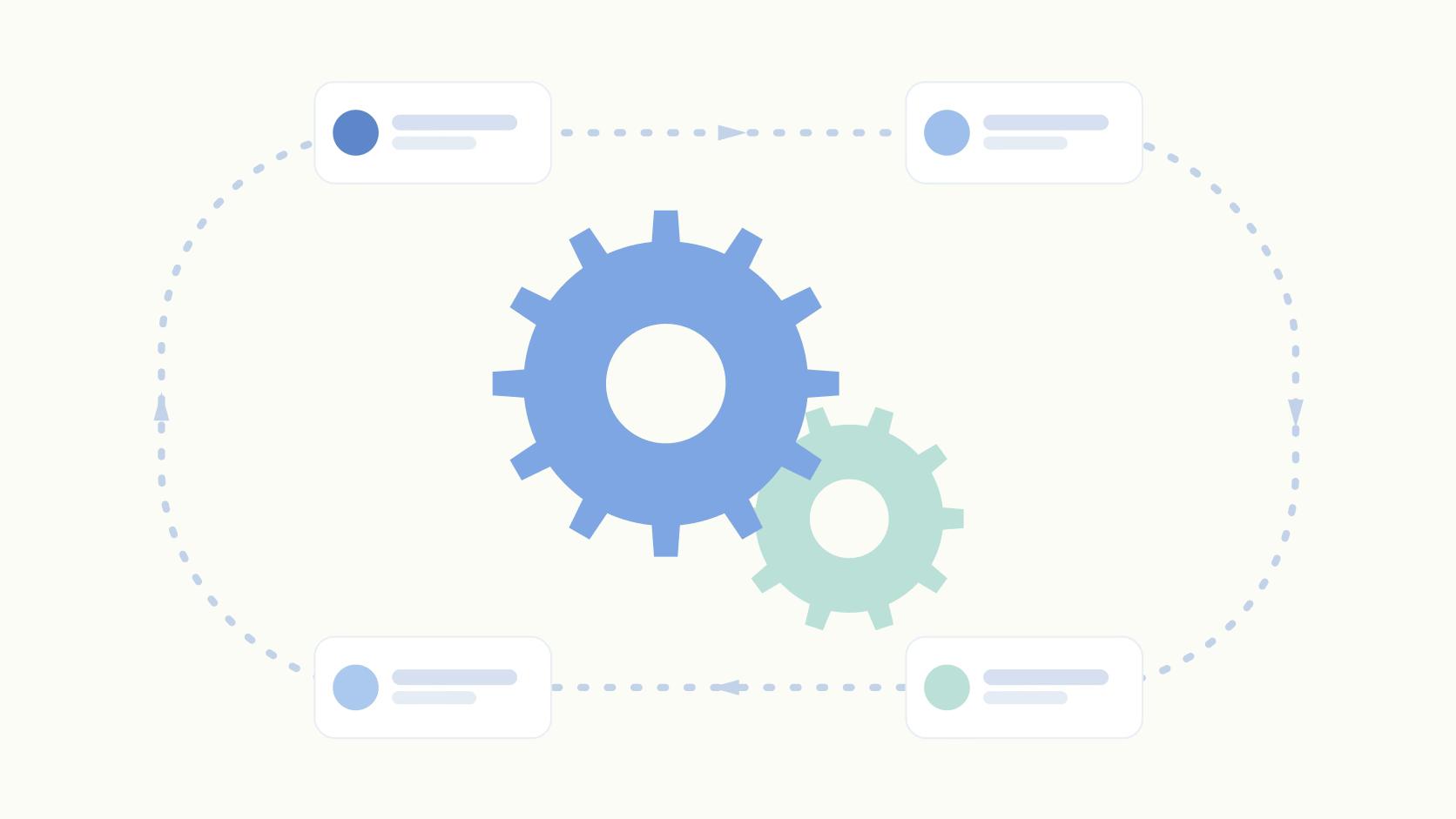
The most useful dashboards organize metrics by what business decision they're supposed to influence. Here's a simple mapping:
- Awareness goal: track reach efficiency (impressions per dollar) and EMV. Action trigger is CPM above benchmark.
- Engagement goal: track engagement rate and comment volume by ICP. Action trigger is a drop below 1.4% for two consecutive weeks.
- Lead gen goal: track CTR and pipeline-attributed mentions. Action trigger is CTR below 0.5% on conversion-focused posts.
- Pipeline goal: track ICP engagement and CRM attribution. Action trigger is target accounts going quiet for 30 days.
Walk through one example: your goal is pipeline contribution.
You track ICP engagement weekly. It drops 20% for two weeks in a row. That's the trigger to audit content mix. You'll likely find you've been over-indexing on product posts and under-delivering on education. Agencies that have applied this kind of framework have seen measurable improvements. Ordinal's work with Influent produced a 20% client performance lift after shifting to analytics-driven content decisions.
How to Build Your Social Media Analytics Dashboard
Step 1: Define the Question
Before picking a tool, write down the one question the dashboard needs to answer. "Is our social content driving pipeline?" gives you something to build toward. "How are we doing on social?" doesn't tell you what to measure. The question determines which metrics belong and which are noise.
Step 2: Pick Your Data Sources
Native analytics from LinkedIn and X are free but siloed and historically shallow. You can export LinkedIn analytics directly, but you'll still end up with separate exports per platform and a manual consolidation step every week. Third-party tools and APIs solve that, at a cost in either money or engineering time.
Step 3: Choose Your Dashboard Tool
Google Looker Studio works well for teams comfortable with data connectors and willing to spend a few hours on setup. Native tool dashboards (LinkedIn Analytics, Hootsuite) are faster but limit you to their metric sets. Purpose-built platforms like Ordinal handle multi-channel consolidation, EMV, and content-label filtering out of the box without custom engineering.
Step 4: Set Baselines and Benchmarks
Pull 90 days of data before building any visualization. Without a baseline, you're just watching numbers move with no way to know if the movement is good. Use the 1.4-2.8% engagement rate from Keekee360 as your industry floor and set account-specific targets from there.
Step 5: Automate and Distribute
A dashboard no one checks isn't a dashboard. It's a file. Schedule a weekly report to land in a shared Slack channel or email thread before your content planning meeting. Daily refresh for the social manager, weekly summary for the VP, monthly rollup for the CFO.
Common Mistakes That Make Dashboards Useless
The most common mistake is tracking impressions without engagement context. A million impressions at 0.3% engagement tells a very different story than 50,000 impressions at 4.5%, but most dashboards don't surface that comparison automatically.
Mixing organic and paid in the same view is the second. When the two are blended, you can't tell whether a spike in reach came from a great post or a boosted ad. Keep them in separate views so each tells a clean story.
The third mistake is updating the dashboard monthly instead of weekly. By the time you spot a declining engagement trend in a monthly review, the content cycle has already moved past the point where you could act on it. Weekly cadence is the minimum for a dashboard that actually changes decisions.
How Ordinal Handles This
Ordinal's analytics layer covers the metrics above without requiring a custom build. EMV is calculated automatically. Content label filtering lets you break down performance by category (thought leadership vs. product posts vs. customer proof) in a few clicks. ICP lead data (on Enterprise) shows which individual LinkedIn profiles engaged with each post, so you can surface warm accounts for sales.
The platform is also open by architecture.
Teams can pipe Ordinal data into their own warehouse via API, webhooks, or the MCP server, and build custom dashboards or AI-driven reporting on top. Zapier's social team built custom employee advocacy dashboards and leaderboard tracking entirely through the Ordinal MCP in a single afternoon. See how Clay scaled from 8,000 to 120,000 LinkedIn followers with a single-person social team in the Clay social-to-revenue case study.
Final Thoughts
Social analytics dashboards that actually change decisions start with pipeline as the north star, then work backward to the five or six metrics that show movement toward it. Not 25 metrics. Not whatever your tool surfaces by default.
If you're starting from scratch: pick one question, pull 90 days of data, and establish baselines before building any visualization. A dashboard without a benchmark is just a chart with no context. Once you have baselines, set action triggers. The specific threshold that forces a content or channel decision. That's when reporting becomes operational.
If you're still stitching Buffer, Sheets, and Zapier together every week, the Clay social-to-revenue case study is a good starting point for what a revenue-tied social operation looks like in practice.
Frequently Asked Questions
What Is a Social Media Analytics Dashboard?
A social media analytics dashboard is a centralized view of performance metrics across your social channels, pulling data from platforms like LinkedIn, Twitter/X, and Instagram into one place. The best B2B dashboards go beyond raw numbers. They tie each metric to a funnel stage and a business outcome, so you're not just reporting what happened but informing what to do next.
What Metrics Should a B2B Social Media Analytics Dashboard Track?
The metrics that matter for B2B are reach efficiency, engagement rate, click-through rate to owned properties, ICP engagement, earned media value, and pipeline-attributed mentions. Raw follower counts and total impressions are floor metrics. Useful for context, but not for answering whether social is contributing to pipeline.
What's a Good Engagement Rate Benchmark for a Social Media Dashboard?
Average engagement rates ranged from 1.4% to 2.8% across major platforms in 2025, according to Keekee360's analysis of social media benchmarks. B2B teams on LinkedIn typically aim for the higher end of that range. Personal profile posts usually outperform company page posts by a significant margin, so track them separately.
How Do I Build a Social Media Analytics Dashboard From Scratch?
Start by defining the business question the dashboard needs to answer (pipeline contribution, brand awareness, or audience growth). Then pick your data sources, select 5-7 metrics tied to that question, choose a visualization tool like Google Looker Studio, and automate the refresh. Distribute the report on a weekly cadence, not monthly.
What's the Difference Between Native Platform Analytics and a Third-Party Dashboard?
Native analytics from LinkedIn or Twitter/X only show one platform at a time and often limit historical depth. A third-party social media analytics dashboard consolidates multiple platforms, supports custom date ranges, and can layer in business context like content labels, campaign performance, and earned media value that native tools don't offer.
How Often Should a Social Media Analytics Dashboard Refresh?
Daily refresh is the standard for operational dashboards used by social managers. Weekly is fine for executive reporting. Monthly is too slow. By the time you spot a trend, the content cycle has already moved past the point where you could act on it.
What Is Earned Media Value and Why Does It Belong on a Dashboard?
Earned media value estimates what your organic impressions would have cost as paid advertising, calculated by multiplying impressions by a custom CPM rate per channel. It gives marketing leaders a dollar figure to report upward, which makes justifying investment in organic social significantly easier when the CFO asks what social is actually returning.
Can I Build a Social Media Analytics Dashboard Without a Paid Tool?
Yes. You can export data from each platform manually, pipe it into Google Sheets or Looker Studio, and build a basic dashboard for free. The trade-off is time: most teams spend 3-5 hours per week on manual data wrangling. Purpose-built tools eliminate that work and add features like EMV calculation and ICP engagement filtering that are difficult to replicate yourself.
Related Posts
Looking to learn more? The below posts may be helpful for you to learn more about social media and content marketing.